Considering the countless labeled products of all kinds available in sundry stores, it’s astonishingly rare to find a typographical error or similar mistake on packaging. Accidents do happen, however — especially in the case of products manufactured and packaged overseas — as the following images attest.
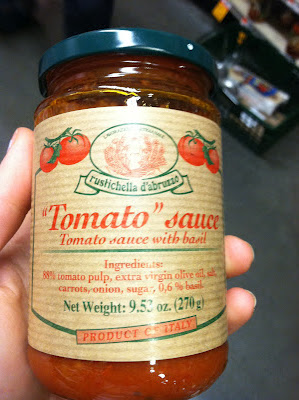
Gratuitous quotation marks, usually seen on handwritten signs because of the sign maker’s misguided intention to “highlight” key words, are virtually unknown on printed packaging. Here’s an exception; perplexingly, whoever was responsible for labeling this tomato sauce considered it necessary to emphasize tomato. This strategy, however, often has an effect opposite to that intended; enclosing a word in quotation marks implies that the product is ersatz — imitation tomato sauce, anybody?
Furthermore, each word in the primary line of identification (I’m sure the advertising industry has catchy jargon for this feature) — in this case, “‘Tomato’ sauce” — is generally initially capitalized if the line is not rendered entirely in uppercase letters, so sauce should be promoted to Sauce. (There are also a couple of errors at the end of the ingredient list: In many countries, a comma, rather than a period, is used to denote a decimal, but this Italian product’s text should have been Anglicized; also, no letter space should separate the percentage figure from the percent sign.)
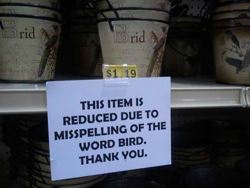
How’s that for customer service? A word with four letters — as opposed to a four-letter word, which is something else entirely — apparently the only text on what appears to be a small metal pail, is misspelled. (I guess the manufacturer’s proofreader was absent from work that day.) To try to make amends, the store management — props to some vigilant employee! — reduces the product’s price. Frankly, I would pay dearly for this word-nerd collector’s item.
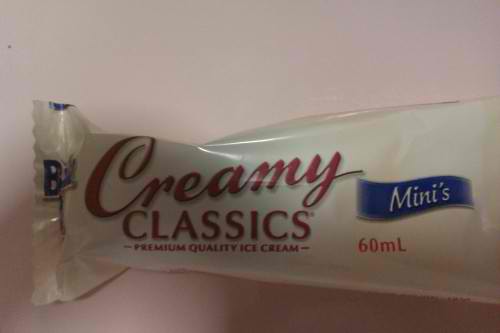
The apostrophe in Mini’s is extraneous, but the perhaps deliberate error is understandable but not excusable: Minis looks awkward (“What’s a min-iss?”). How about just Mini, though?
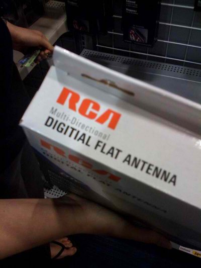
Such a prominent error on a package produced by a major corporation and featuring such sophisticated packaging design is very nearly astounding, considering that RCA and the like have entire departments devoted to vetting advertising and marketing content; I once proofed packaging for a (smaller) company myself.
In addition, multidirectional needs no hyphen, but trying to eradicate that ubiquitous anachronism — like most prefixes, multi- was originally attached to root words with a hyphen — is a lost cause.
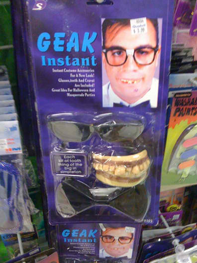
Geak? I admit misspelling nerd in my college newspaper, but this is absurd. (And anyone who wears this geaky Halloween gear is a freek.)
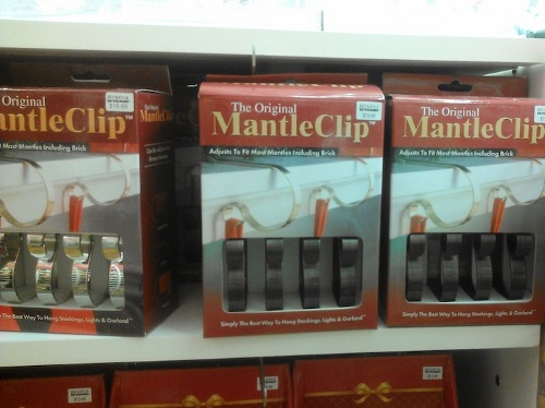
Yes, yes, Merriam-Webster’s Online cites mantle as a variant spelling for the word for the structure over a fireplace, but that’s an observation, not an endorsement. Let’s maintain the distinction between mantel and mantle, which share an etymology but — among careful writers, at least — have unique meanings.
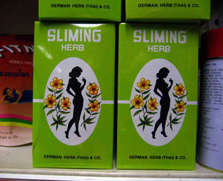
Who among us doesn’t want a slimer body? Let’s just hope it doesn’t turn our body black, like that slimed-down silhouette.
These images are from the websites Apostrophe Abuse, English Fail Blog, The “Blog” of “Unnecessary” Quotation Marks, and Wordsplosion.com, as well as from Daily Writing Tips reader thebluebird11.

Thanks for these.
I have a picture taken of a sign in an upmarket gardener shop. It was advertising “onion vases”: long-stemmed with a “bulb” at the bottom. They were selling them in threes, and the sign read, “A pair three onion vases” and the price. I kid you not!
I would also pay a premium for the “Brid” pails.
Sorry, my proofreader was absent:
“A pair of three….”
Re: 7 Packaging Label Errors by Mark Nichol.
Mark, so you are bringing to our attention 7 packaging label errors and to certain extent making fun of them. Then:
“Such a prominent error on a package produced by a major corporation and featuring such sophisticated packaging design is very nearly astounding, considering that RCA and the like have entire departments devoted to vetting advertising and marketing content; I once proofed packaging for a (smaller) company myself.”
…you once PROOFED???? Proofed, Mark?
For the Geek glasses and strange teeth, shouldn’t that read “Instant Geek” not Geek Instant. It’s hard to read the rest of the package, but from what I can see, they outsourced their copy writing to a non-English speaking company.
Thanks for sharing.
“I am an exprirenced proofredear.”
In my town, within jus a couple miles’ radius, there was a huge, neon monument sign advertising a RESTARAUNT; a factory-made traffic-orange diamond sign warning that TRUCKS ARE TURNNING; and a road sign from the DOT telling Interstate drivers to EXPECT DALAYS.
There was also the local Burger King whose big sign announcing ANGUS BURGERS was missing angus’s G. When this was pointed out to the manager of the store, it was met with incomprehension.
“Yes, so what’s the problem?…No still don’t get what you’re saying. OK, the G is missing. What’s your point?”
Ohhh, “sliming herb” is too funny!
@Lourdes: What is wrong with “proofed”? It is short for “proofread.”
@venqax: So many of those kinds of errors. I can no longer drive on Commercial Boulevard without flashing back to a lighted highway construction sign that said “Commerical Blvd.” And I actually had to write a letter to a neighboring city because twice a week I cringed as I drove under a street sign that read “31th Street.” Maybe those of us who are OCD had too many of those, uh, burgers. 😉
Can’t even tell you how many dinning tables I’ve seen for sale.
I saw a blue print for a set of plans for a “pubic” library. Another set of plans mentioned “ass” hardware instead of all hardware. Gotta love those proofreaders!
The rest of the ‘Geak’ set is even worse. Next to the teeth it says, ‘Each kit of tooth thing of the big in simpleton’, whatever that’s supposed to mean.
Slimming Herb package: ‘German Herb (Thai) & Co’ at the bottom – am not sure how the geography works on this one!!!
The “Geak” kit is worth a second look. Note the blurb in the middle of the kit, reading “Each kit of tooth thing of the big in simpleton”. Pardon me while I rend my garments in frustration. You’d think there’d be at least one employee at Cheapo Chinese Junky Toys, Inc. who’d be smart enough to check their packaging with someone who grew up speaking and reading correct English, but evidently that was not the case.
Tee-hee! Lovely post. I like how matter of fact the sign is about the pots. No trying to hide it or gloss over it. And I didn’t know about the mantel/mantle bit. I also learned today that mettle is different from metal sparing me years of embarrassment.
I would however like to point out a misstep on that last one: “Let’s just hope it doesn’t turn our body black, like that slimed-down silhouette.”
Perhaps you’re overlooking that some of us already have black bodies and were born with them.
Maybe “Let’s hope we don’t turn into disproportionate silhouettes” would work better? Or “The woman looks like a previous victim of the sliming herb.”
Just thought I’d point it out since it made me pause.
At my local library they’ve had “Librarian” misspelled on their welcome pamphlet for years. Nobody’s noticed. The Librarians themselves find it hilarious and just keep printing them.
Nemo:
Yes, I didn’t think about the fact that some people already have very dark skin — no offense intended, of course.
Stephen:
Thanks for pointing that out! I didn’t read the sublimely ridiculous fine print.
My most recent find:
A Billboard for a local casino reads, “Membership has it’s benefits.”
Obviously, the ability to use correct punctuation is not one of the benefits.
Quoting: “This strategy, however, often has an effect opposite to that intended; enclosing a word in quotation marks implies that the product is ersatz — imitation tomato sauce, anybody?”
There was a nearby restaurant that specialized in sandwiches and hot dogs (including hamburgers, bratwurst, etc), but pizza was also on the menu. On the big menu board in that shop, it said “pizza”.
I pointed out to the manager & owner that perhaps this meant your phony pizza – one made with cardboard, ketchup, and cottage cheese. He got a big laugh out of this, but he never did change the sign.
Unfortunately, that place went out of business within a year of that. It was the closest place to me for buying hamburgers, pizza, deli sandwiches, etc., and that shop also made deliveries.
In my town now, the only foods that we can get delivered to our homes are Italian: pizzas, pastas, and hot Italian sandwiches.
I once lived in a big city where we could get just about any kind of food delivered. There was a delivery company that had contacts with dozens of different companies. We phoned the delivery company, and then it ordered the food from the restaurant, picked it up, and delivered it.
D.A.W.
Doesn’t anyone else notice that “sliming” could be comething from the movie “Ghost Busters” (the official spelling)?
That movie and its sequel has supernatural creatures that go around sliming people.
Naturally, I don’t want to eat or drink anything that is going to get me slimed! I can do without that.
D.A.W.
To: Judi Schneider
“Blueprint” is just one word – a compound word – and not two words, and it has been this way for a very long time.
I learned this in high school in 1972, but I am sure that I had seen “blueprint” even earlier than that. Good dictionaries trace the source of this word all the way back to 1885 – 90.
I have a pet peeve about people who split well-established compound words such as these {miniskirt, supermodel, antediluvian, battlecruiser, northeastern, northweastern, microcomputer, minicomputer, ultrahigh frequency, supercomputer}.
Also look out for semihemidemiquaver and magnetohydrodynamics.
I had a discussion with another engineer recently who could not believe his eyes when he say “nontransformable” without any hyphens in it.
I told him to consider “countercounterrevolutionary”.
I think that maybe this one convinced him.
D.A.W.
Good post. I once saw an energy bar on the rack of a bodega in Manhattan. The label read, “NOW WITH 125% LESS FAT!” Someone had switched the numerator and denominator in the calculation.
Wish I had bought it.