Advertising in the form of signage printed on vehicles is a road hazard when exasperating errors and extraneous elements in the mobile messaging distract motorists. Here are photographs of seven moving violations, with commentary.
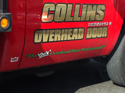
The motto painted on this truck not only commits a quintuple-overkill foul but also is flatly incorrect. The worst infraction, beyond the extraneous quotation marks framing the message, appears to be the placement for emphasis of an additional set of quotation marks around only. (If one wishes to employ one set of quotation marks inside another, the interior ones — in American English, at least — should be single; in British English, the order is reversed. But here, neither set is necessary.)
But that’s still not enough — the word is also placed at a jaunty, pseudo-italicized angle, underlined, and printed in a different font and color than the rest of the slogan. Just one or two forms of accentuation would have been sufficient. The worst error, however, is that the company is not the “only” overhead-door professional (note the insertion of a missing hyphen in the previous phrase); it may be the sole provider of overhead-door services in its home city, but then the motto should close with “in town.” But why not simply say, without quotation marks or any other emphasis, “Our overhead-door service rises above the rest!” Was that motto already taken?
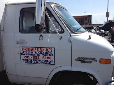
This sign sports merely mild mistakes, but they’re insistently irritating, like a small burr in one’s sock. Note the extra letter spaces between the (unnecessary) open and close quotation marks bracketing “We’re Affordable.” The hyphen in “Clean-Outs” (which should be “Cleanouts”) also hangs in midair, as do the hyphens separating the elements of the phone number.
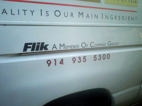
There is so much wrong with this superficially satisfying vehicle signage. First, too many fonts compete with each other. Then, the letters in the slogan “Quality Is Our Main Ingredient” are too widely spread, while those in the next line are too compact — and then the elements of the phone number are nearly segregated into different time zones.
The middle word in the phrase after Flik, strictly speaking, shouldn’t start with an uppercase letter; of is one of the “little words” that doesn’t merit capitalization in display type. (However, capitalizing it is a defensible style choice.) But the inexcusable error is the misspelling of member. Nobody at the sign shop and nobody at the client company noticed that? Really?
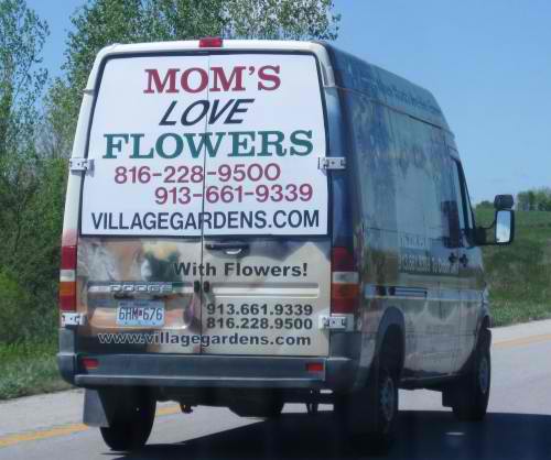
Busy, busy, busy. Too many colors, too many fonts, too many words. The key crime, however, is the common error of mistakenly styling a plural construction as if it were a plural one. This sign implies that love flowers belong to Mom. The message, however, should read, “Moms Love Flowers.”
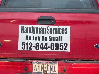
No job is too small, but sometimes words are — to should be too.
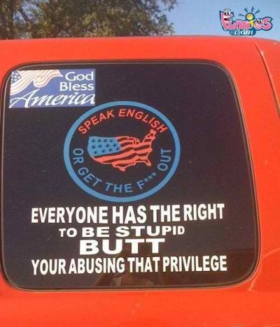
This asininely assertive window panel proves that everyone has the right to appear stupid, too. The oddly inconsistent swelling treatment of the letters in each line — notice how the characters in the lines beginning with everyone and to grow and recede in size from left to right, but the words in the third and fourth lines are uniformly sized — might distract viewers from the unfortunate fact that but is amusingly misspelled and the wrong spelling of you’re is employed. Write English correctly, or . . . .
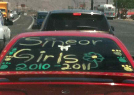
This fortunately ephemeral expression is head-slappingly hilarious. One hopes (and presumes) that the “sineor” girl who sprayed this signage a couple of years ago — assuming she graduated — is not employed in the wordsmithing world.
These images are from the websites Apostrophe Abuse, English Fail Blog, Funnies.com, The Great Typo Hunt, and The “Blog” of “Unnecessary” Quotation Marks.

Then there are signs whose juxtaposition makes them hilarious. One on a business marquee near my home reads: A Stitch in Time. Located in the rear.
What a great smile to start the day!
What if, in that sign, the Handyman was indeed refusing services to a person named “Small?”
What if, in that other sign, the sellers’s mother was indeed the one selling “Love Flowers?”
(The above messages are in jest. Not intended to be a troll post.)
I enjoy the site and the daily emails, but this particular post is just silly. I hope it was supposed to be comical because your evaluation of some of the signs is just that. From a marketing perspective, the first sign is excellent, and though the other business signes may have some issues, it is in the nature of marketing to be eye-catching. Obviously, they succeeded. As for the non-business signs, I agree with the assessments. But this is taking word smithing just a little far.
Note: The hyphen in “Clean-Outs” (which should be “Cleanouts”) also hangs in midair, as do the hyphens separating the elements of the phone number.
The spaces before and after the hypens in the telephone number do make the number more legible from a distance, and that is the whole point of putting one’s phone number on the outside of a service truck, isn’t it?
Back in the early 1980s, there was a large company in Los Angeles County with many food service trucks, and on their left and right sides were painted in bright red letters:
Call 213 – HOT – FOOD , with the blanks to make it more legible from a distance.
Now, Los Angeles County has so many different Area Codes that this might not work, unless they are still local calls from one another. Maybe that company has a toll-free number by now:
Call 1 – 888 – HOT – FOOD , for example.
My mother, who was a crackerjack high school English teacher, taught me to always type blanks before and after hyphens before and after hyphens, for the sake of legibility. I still think that people should follow this practice. Let me give you some examples:
12 – 17 – 1903, the date of the Wright Brothers’ first four flights.
Anglo – American. Canadian – American. French – Canadian.
sub – Saharan.
The latter is an exception to the rule that “sub” and many other prefixes are glued directly onto the root word. (non – Catholic is another)
See these words: subalpine, subarctic, subcutaneous, subdural, subflooring, subfield, subgroup, subharmonic, subjective, subluminal, submarine, subnetwork, suboptimal, substratum, and subsonic.
Some British and Irish people feel compelled to hyphenate some of these words, and especially submachine gun.
In North America, we have disposed of all of those hyphens, and we do quite well without them. These have stood the test of time, and why cannot all other English writers see our success and adopt it? Not because of its nationality, but because it works well?
Oh, well, I am an engineer, and my eyes are always open for what works well….
D.A.W.
I thought that maybe the young women with the red car mght have been trying to write “Singer Girls” and they were advertising their business to passersby. Looking for paid work, that is.
However, you are right: “Senior Girls” is probably more likely – but how did they become seniors in high schol?
D.A.W.
To Mark Nichol:
What you wrote: “the common error of mistakenly styling a plural construction as if it were a plural one.” does not make any sense.”
You have just repeated the word “plural” twice.
What you meant to write was probably this:
“the common error of mistakenly styling a possessive construction as if it were a plural one.”
Please correct this as quickly as you can.
D.A.W.
Grammar aside, one of my favorite slogans on a truck advertising an exterminating company (now, defunct), is: We Smoke Your Roaches! …Very clever.
There are a lot of things to complain about the Flik sign, but did no one notice the phrase, “quality is our main ingredient”? What quality do they mean exactly? Churlishness? Ebullience? Quality means characteristic or a set of characteristics, does it not? It’s misuse as in “a quality education” drives me nuts. Even when a school offers “a high quality education”, I tend to think it probably does not.
Am I missing something here?
You might want a do-over for this sentence from your first item:
“But that’s still not enough — the word is also placed at a jaunty, pseudo-italicized angle, underlined, and printed in a different font and color than the rest of the slogan.”
You wouldn’t have had to strain to use the more acceptable “different…from” construction.
If you throw stones in your glass house…
…then please correctly use your ellipses.
“No Job To Small” Perhaps that expresses the range of project sizes the handyman will take on. One can’t handle big jobs with a small truck.
The “Speak English” truck could well have been a troll, with an intentionally STOOPid sign to make English-only advocates look bad.
The last photo suggests that the girls don’t like math students, and are presenting an ultimatum. (sine or girls) — sort of like “Ellipses that touch wine will never…” etc.